Offcanvas

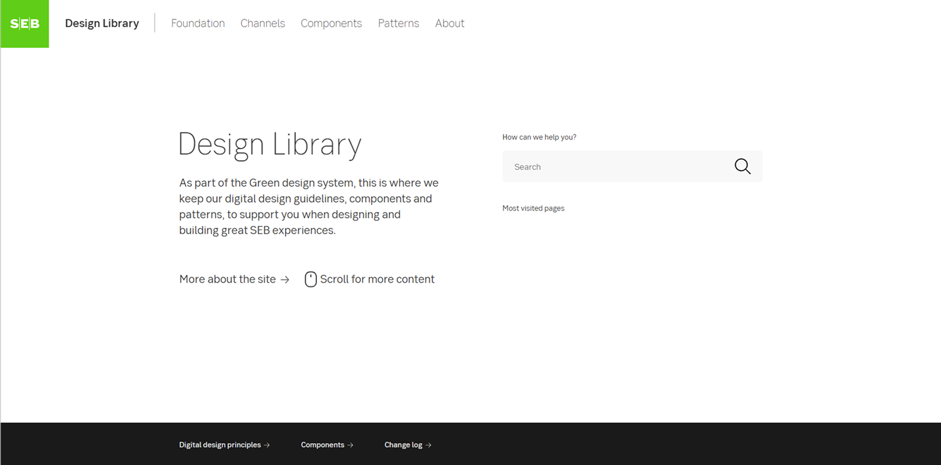
SEB Design Library
Skandinaviska Enskilda Banken's digital design guidelines, components, and patterns for creating cohesive user experiences.
Do you use SEB Design Library?
Accessible Components: Built following WCAG and WAI-ARIA guidelines for inclusivity.
Customizable and Scalable: Designed to adapt to SEB’s various digital products and platforms.
Reusable UI Components: Includes buttons, forms, tables, modals, and navigation elements.
Comprehensive Documentation: Provides design principles, implementation guidelines, and best practices.
Design Tokens: Standardized values for colors, typography, spacing, and UI consistency.
Dark Mode Support: Built-in theming capabilities for light and dark modes.
Cross-Platform Compatibility: Supports web and mobile applications.
Regular Updates: Continuously refined with improvements, new components, and feedback integration.


