Offcanvas

Do you use Chakra UI?
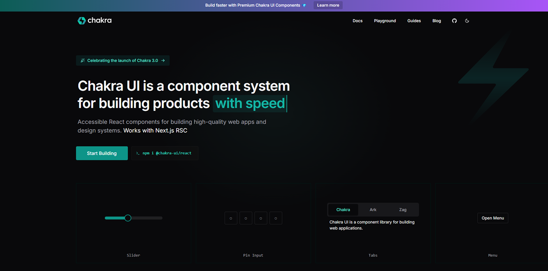
Accessible Components: Built with WAI-ARIA standards to ensure inclusivity.
Themeable Design: Uses a powerful theming system with design tokens for customization.
Composable and Modular: Provides reusable components that can be easily combined.
Dark Mode Support: Built-in support for dark and light themes.
Developer-Friendly: Optimized for DX with intuitive props and TypeScript support.
Flexbox and Grid Support: Simplifies responsive layouts with utility-first styling.
Animation-Ready: Works well with Framer Motion for smooth animations.
Lightweight and Performant: Optimized for speed and minimal bundle size.