Offcanvas

UI components
UI components
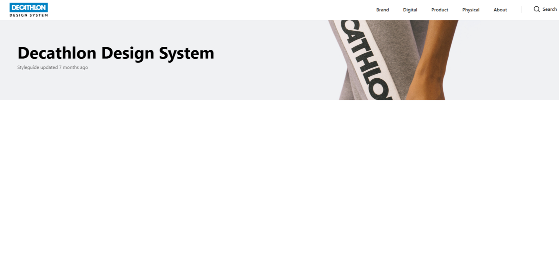
Decathlon Design System
Decathlon's design system, known as Vitamin, provides a framework to design and develop consistent and quality user experiences across their digital ecosystem.
Read more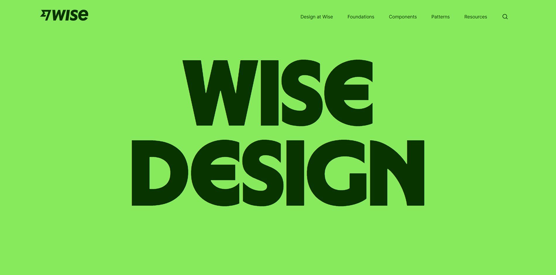
Wise Design
Wise's design system crafted to create clear and consistent user experiences, emphasizing global accessibility and inclusivity.
Read more
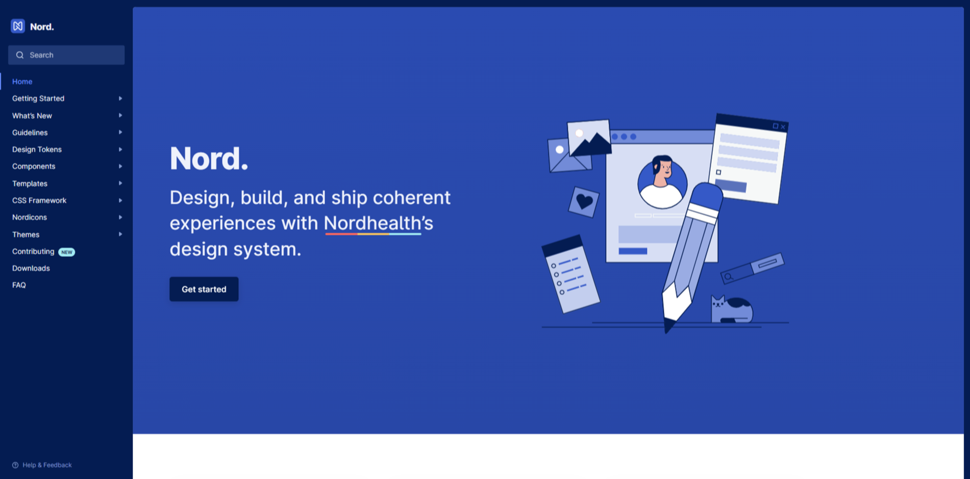
Nord Design System
Nordhealth's design system comprising reusable components and tools, guided by clear standards for building digital products and experiences.
Read more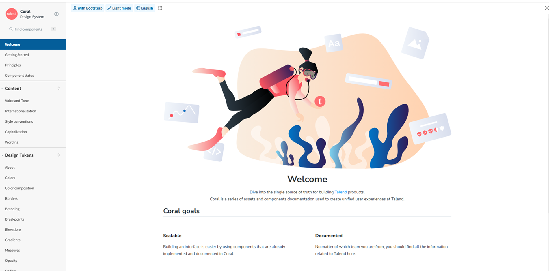
Coral Design System
Talend's design system offering a unified set of assets and components to create cohesive user experiences across their products.
Read more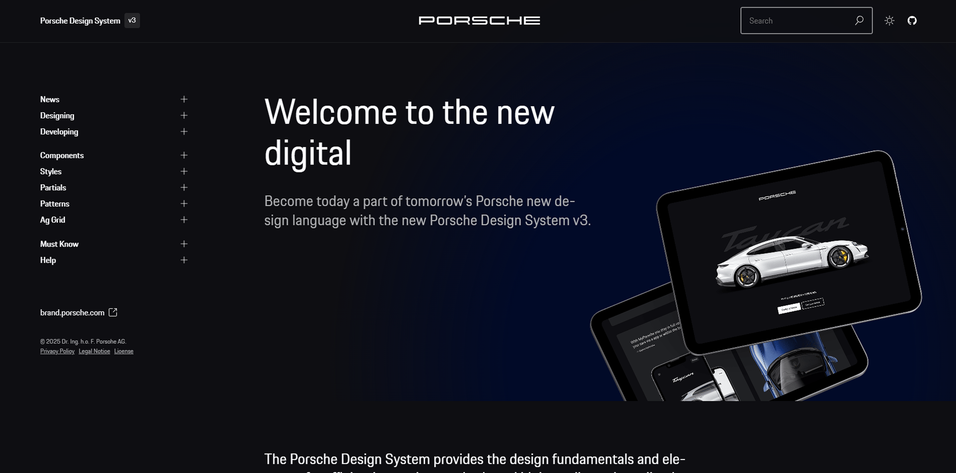
Porsche Design System
Porsche's design system offering a collection of components, guidelines, and tools to create consistent and high-quality user experiences across their digital platforms.
Read more
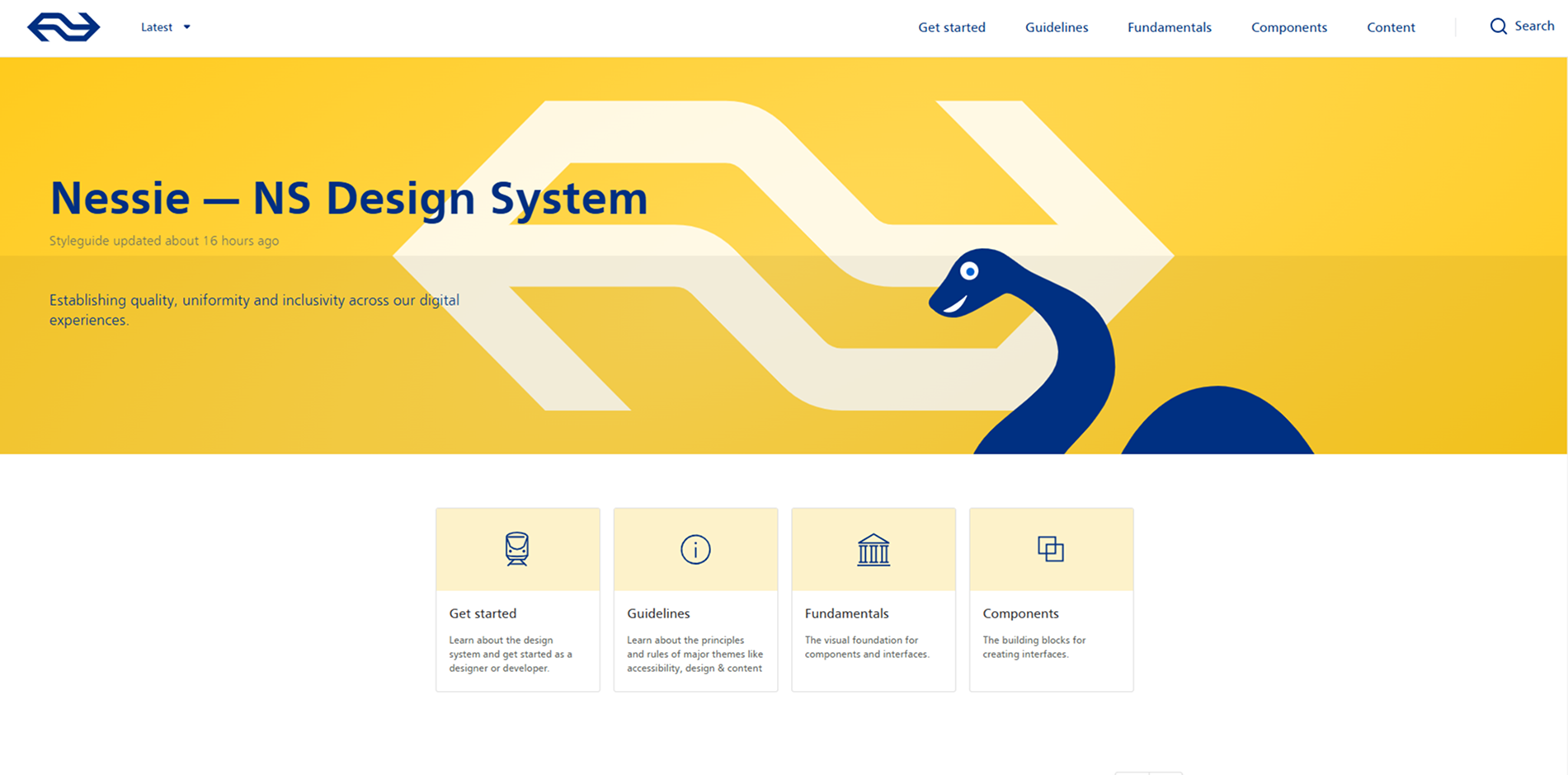
Nessie Design System
Nederlandse Spoorwegen's design system providing components and guidelines to create consistent and user-friendly interfaces for their digital platforms.
Read more
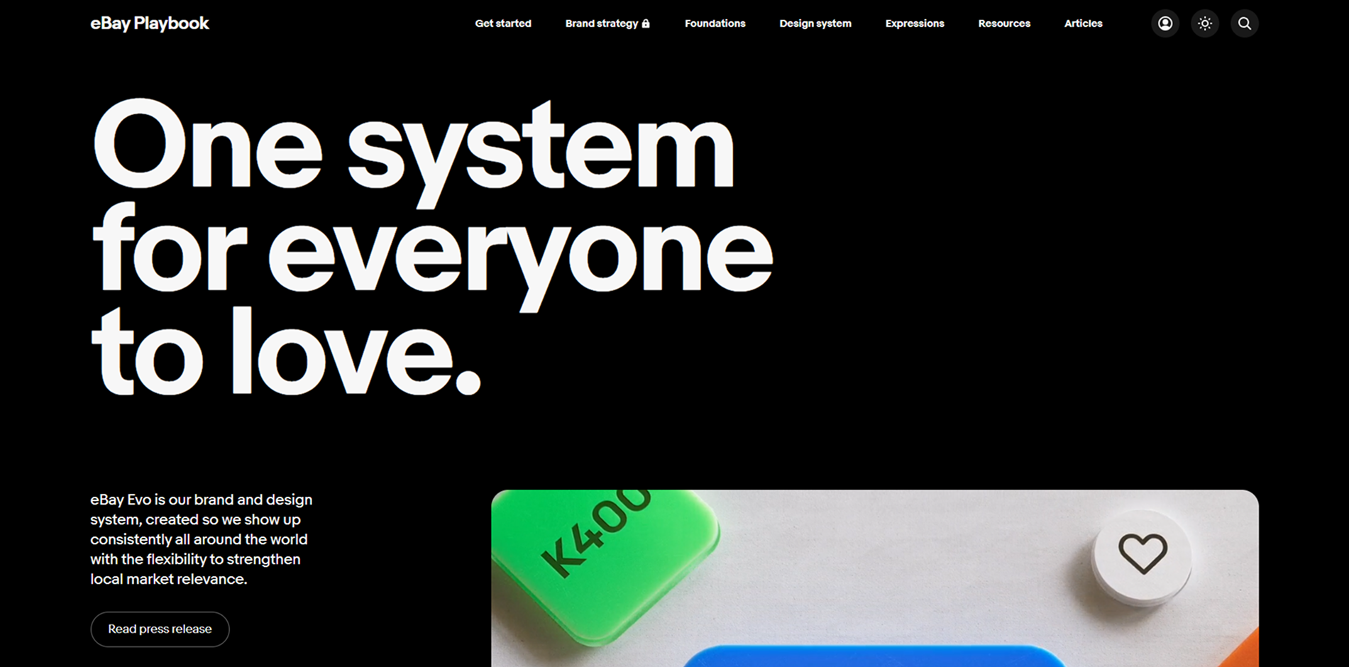
eBay Playbook (Evo Design System)
eBay's brand and design system, Evo, created to ensure consistent global presence with flexibility for local market relevance.
Read more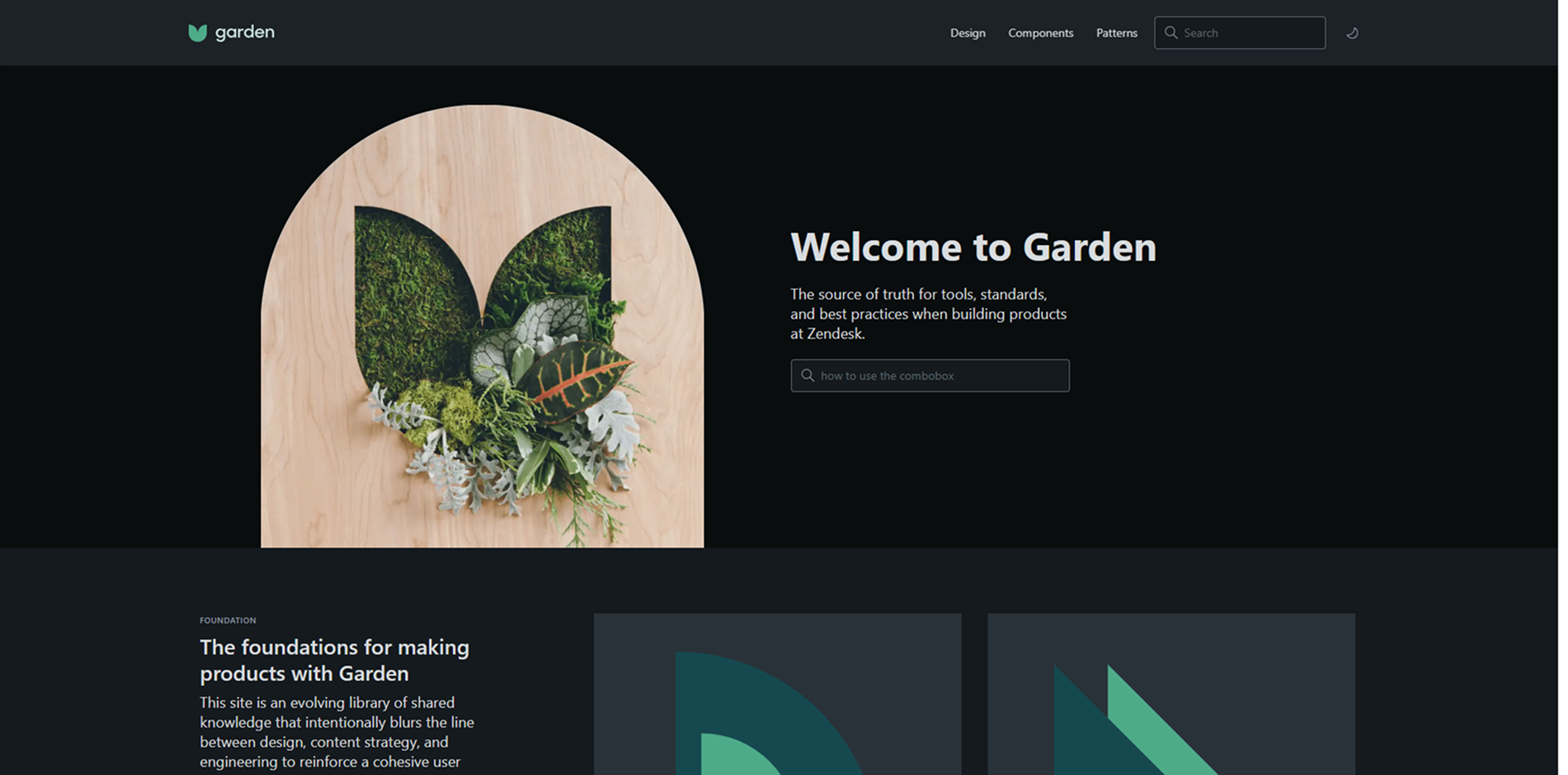
Zendesk Garden
Zendesk's design system providing tools, standards, and best practices for building cohesive user interfaces across their products.
Read more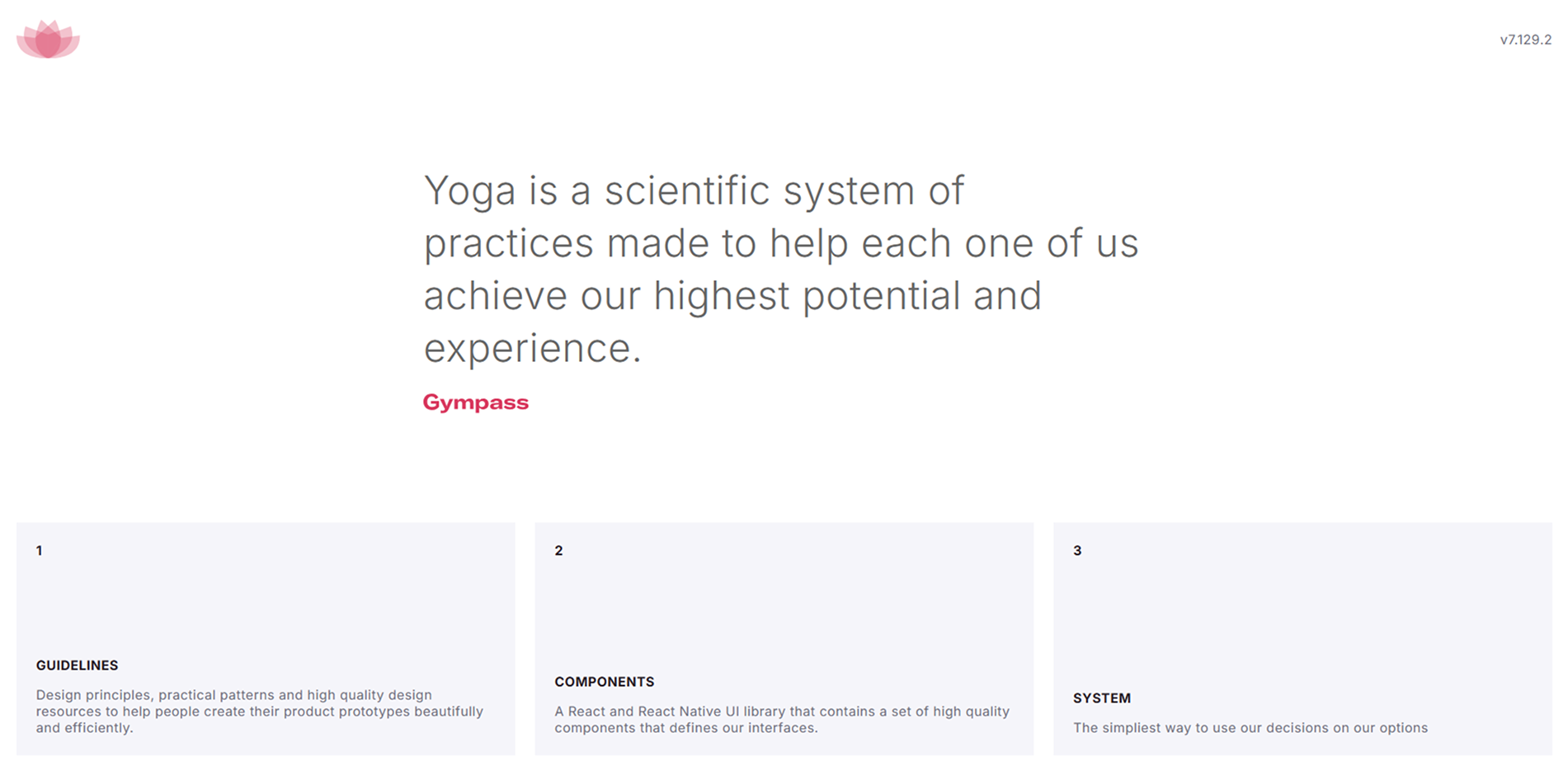
Yoga Design System
Gympass's design system offering principles, patterns, and high-quality design resources to create beautiful and efficient product prototypes.
Read more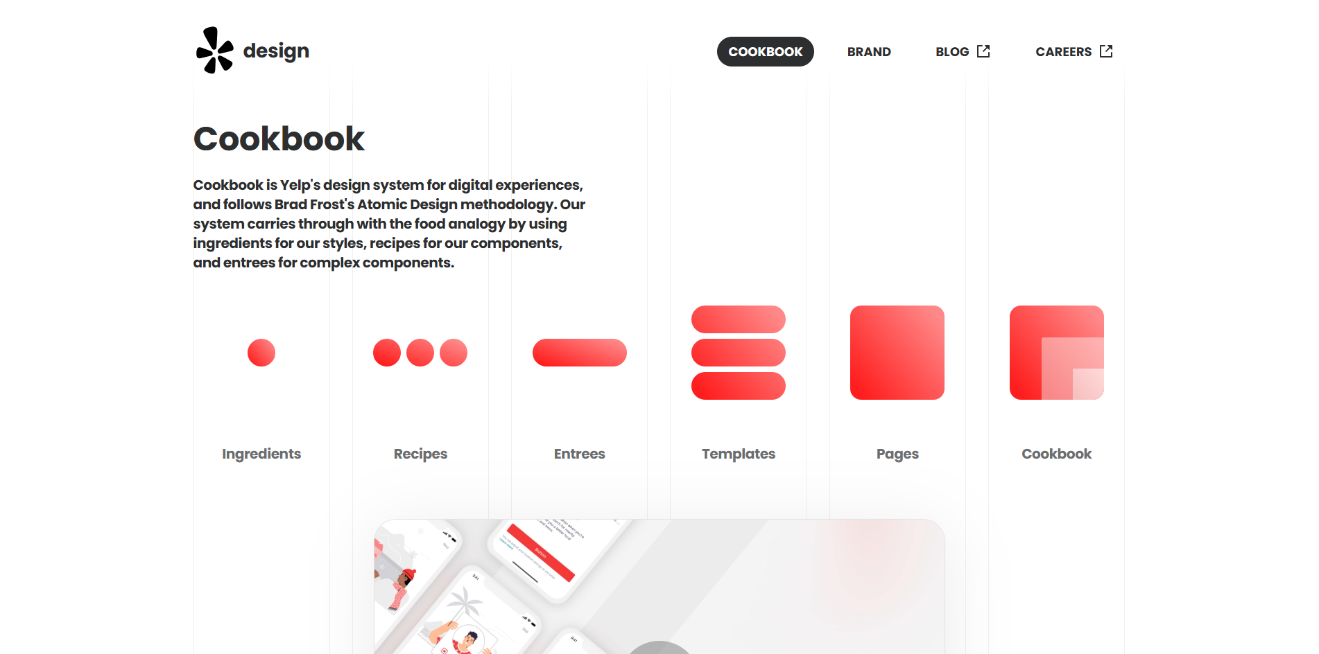
Yelp Styleguide
Yelp's style guide providing a comprehensive set of design patterns and components to maintain consistency across their web and mobile platforms.
Read more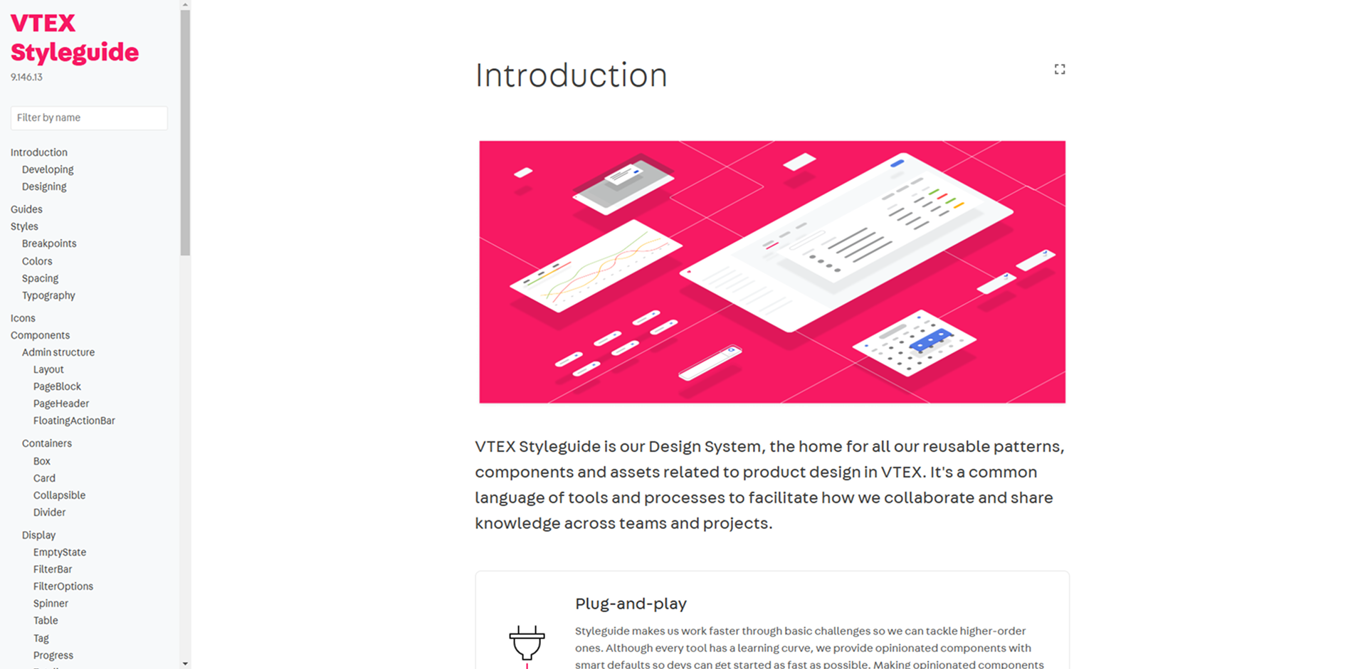
VTEX Styleguide
VTEX's style guide offering a collection of reusable components and standards to build consistent and scalable user interfaces across their platform.
Read more
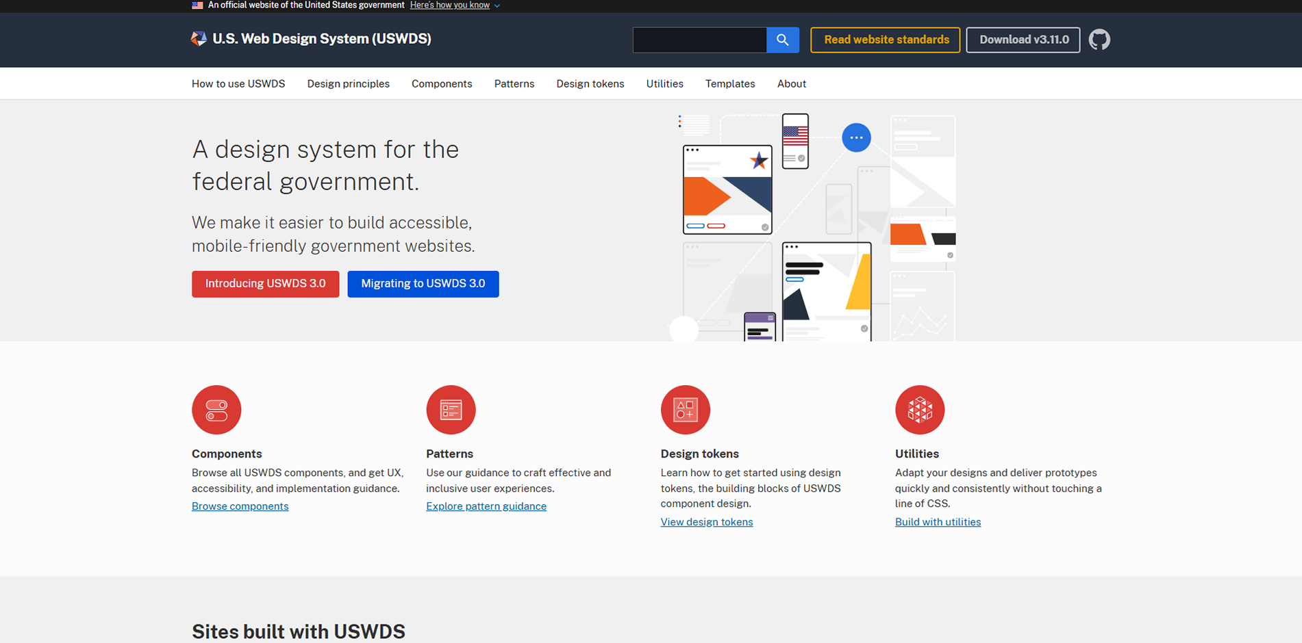
U.S. Web Design System (USWDS)
A design system for the federal government, making it easier to build accessible, mobile-friendly government websites with reusable components and design patterns.
Read more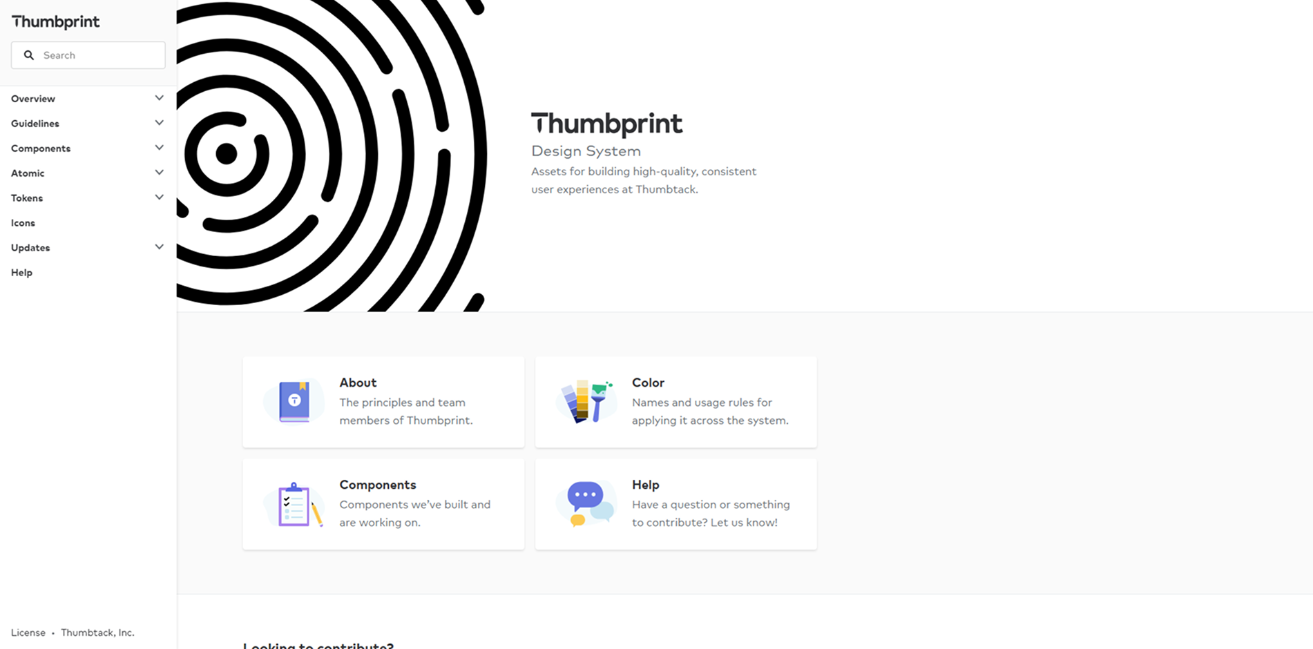
Thumbprint
Thumbtack's design system offering assets for building high-quality, consistent user experiences, including guidelines, components, and tools for designers and developers.
Read more