Offcanvas

UI components
UI components
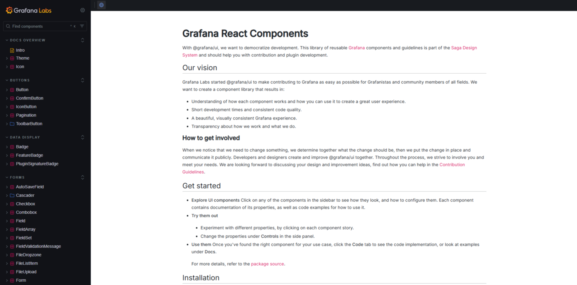
Grafana UI
Grafana's collection of reusable UI components, designed to create consistent user interfaces within Grafana plugins and applications.
Read more
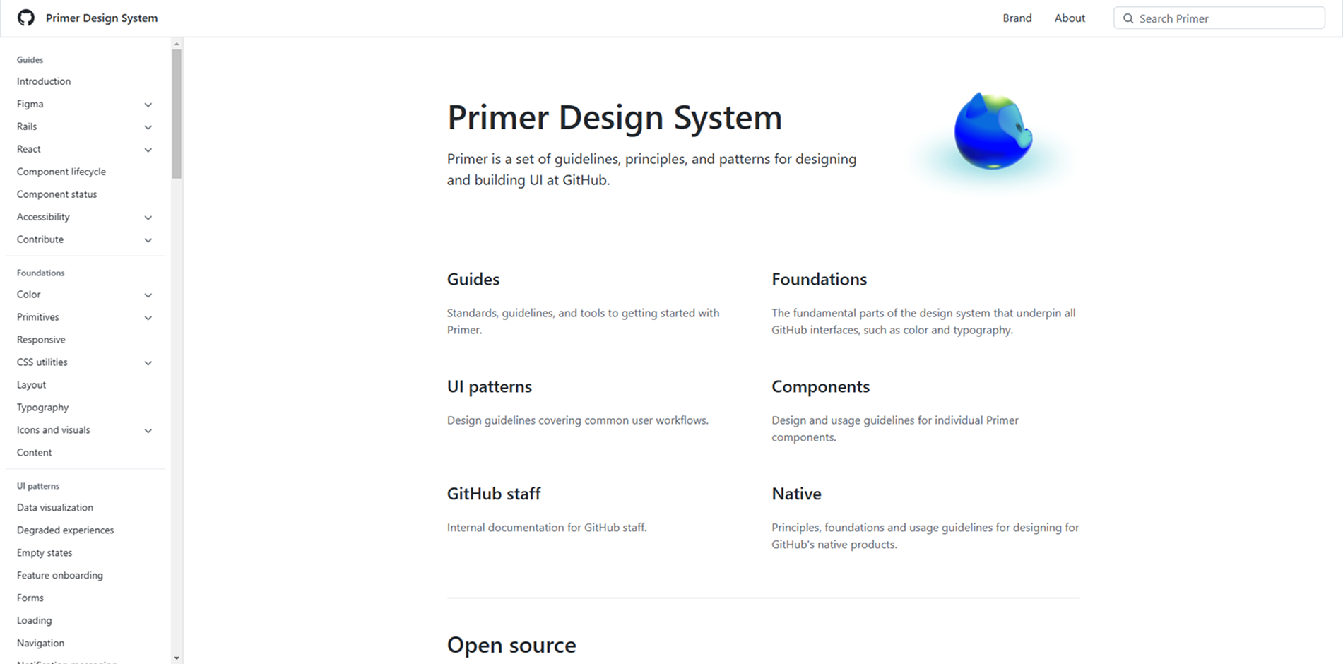
Primer Design System
GitHub's design system, providing guidelines, principles, and patterns for UI development.
Read more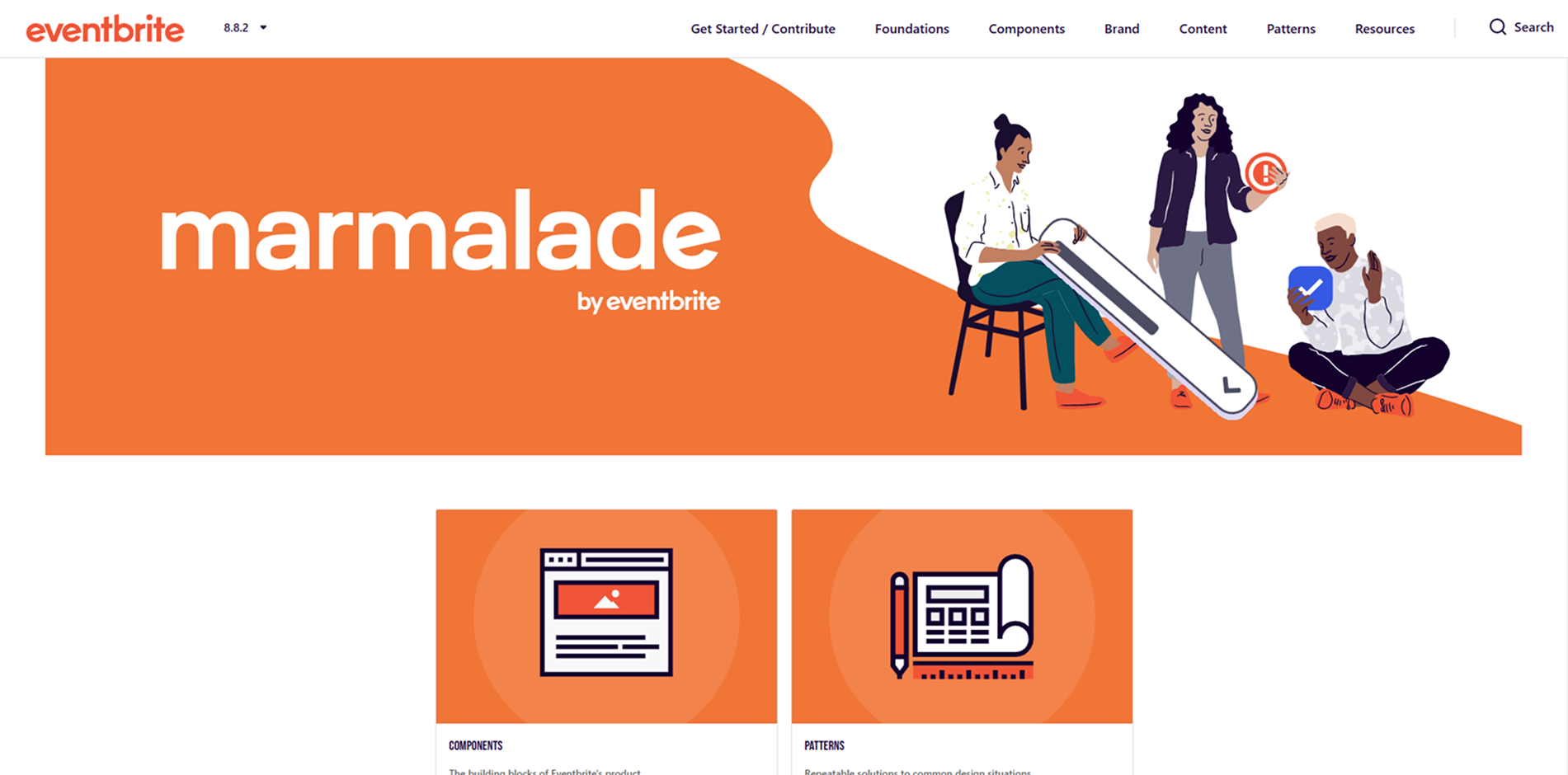
Marmalade Design System
Eventbrite's design system, promoting unified work, communication, and creation.
Read more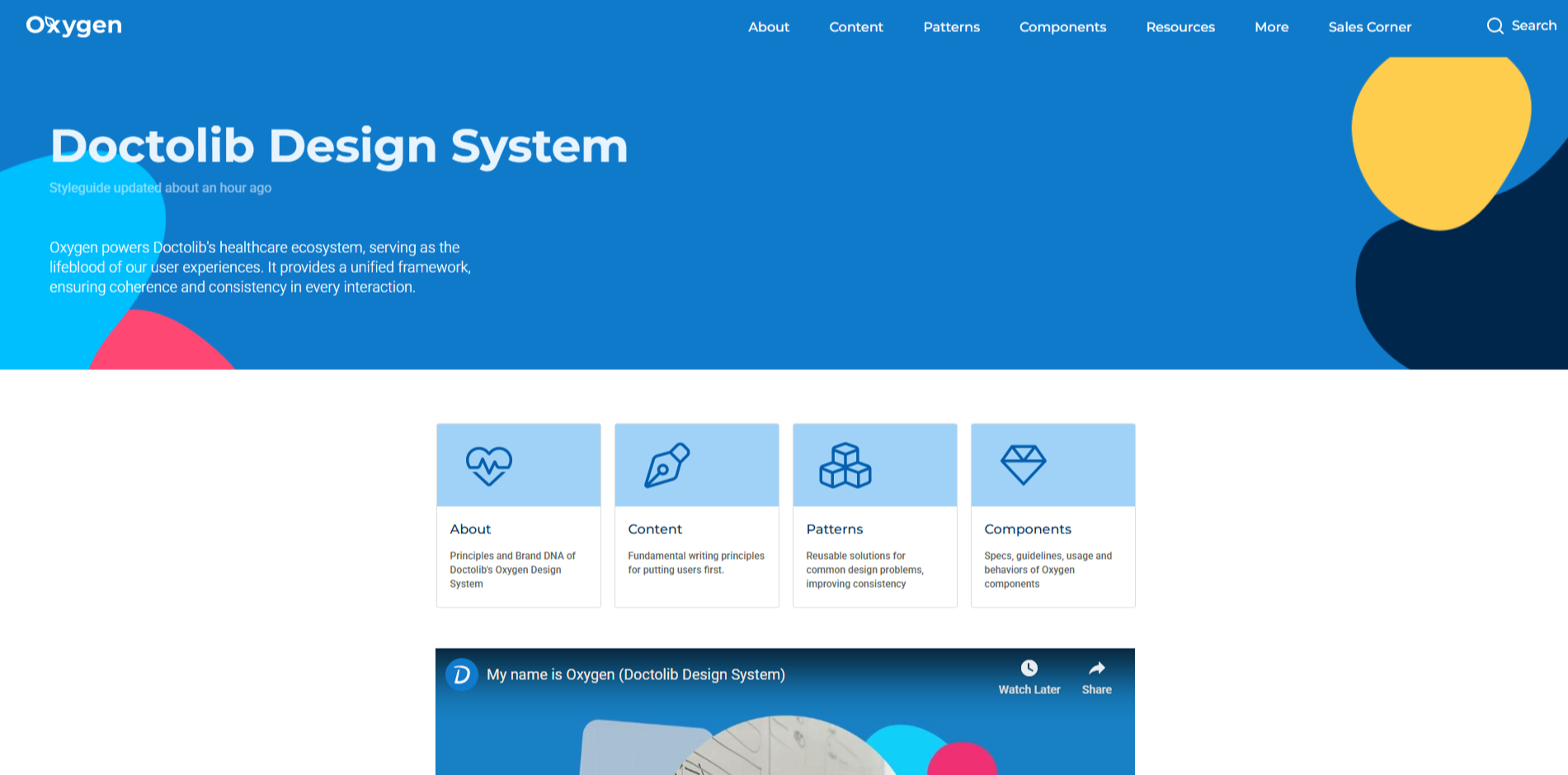
Oxygen Design System
Doctolib's design system, fostering collaboration between tech and product teams.
Read more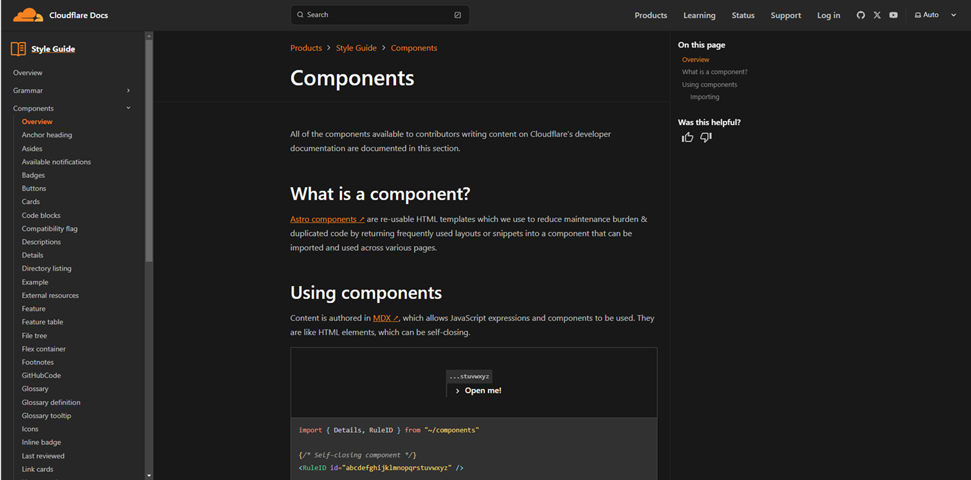
Cloudflare Style Guide Components
A comprehensive style guide by Cloudflare, detailing UI components and design principles.
Read more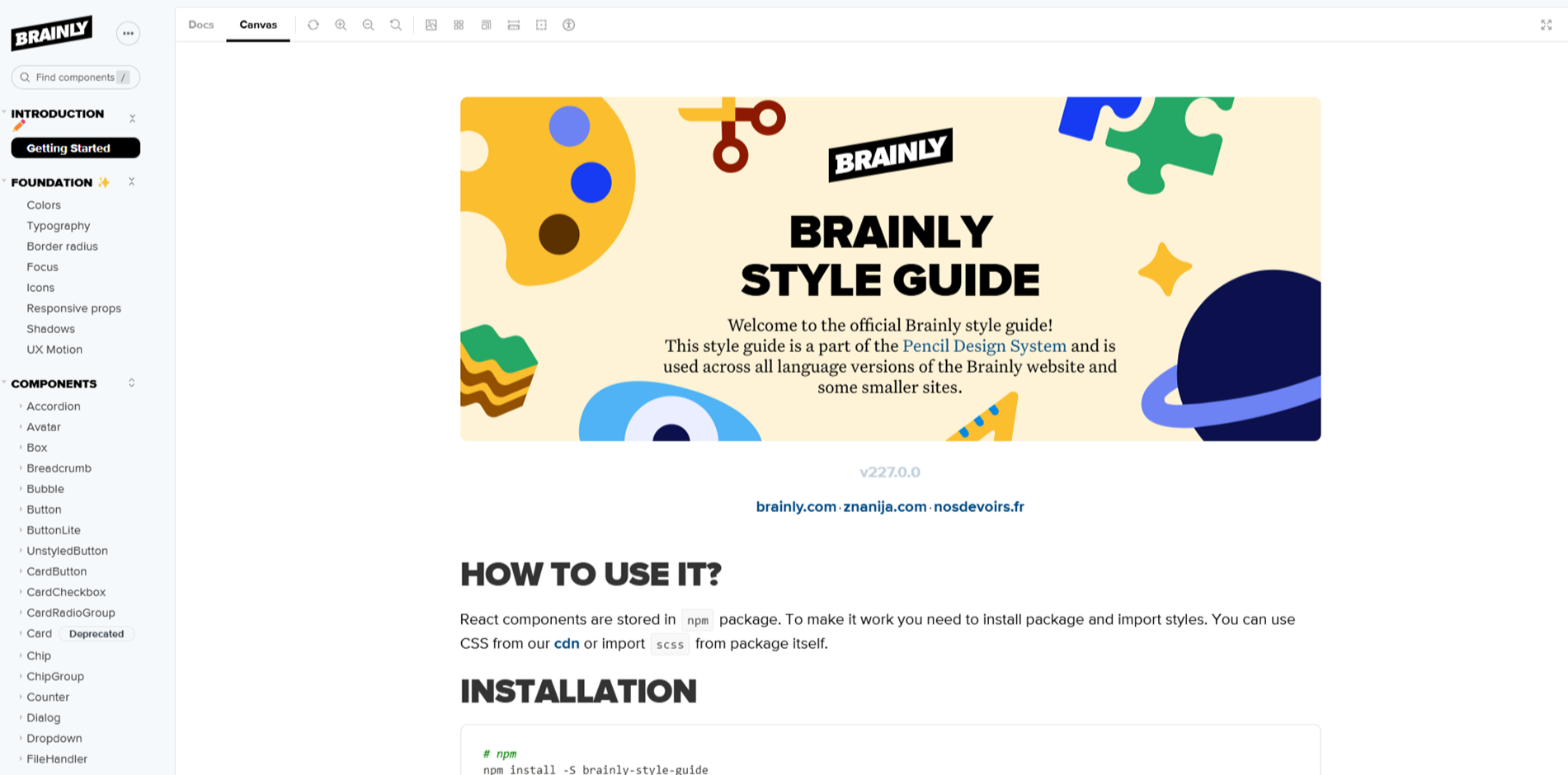
Brainly Style Guide
A comprehensive design system that ensures consistency and efficiency in Brainly's UI/UX development.
Read more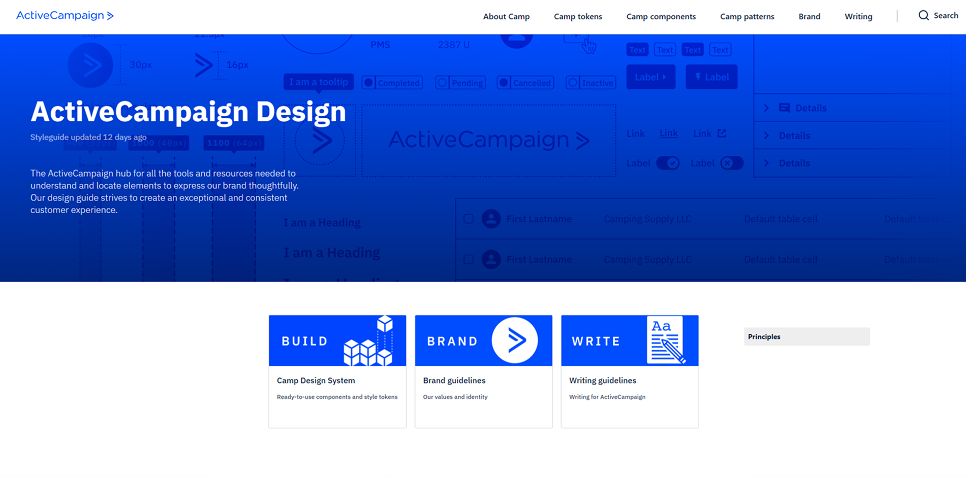
ActiveCampaign Design System
ActiveCampaign's hub for tools and resources to express their brand thoughtfully across products.
Read more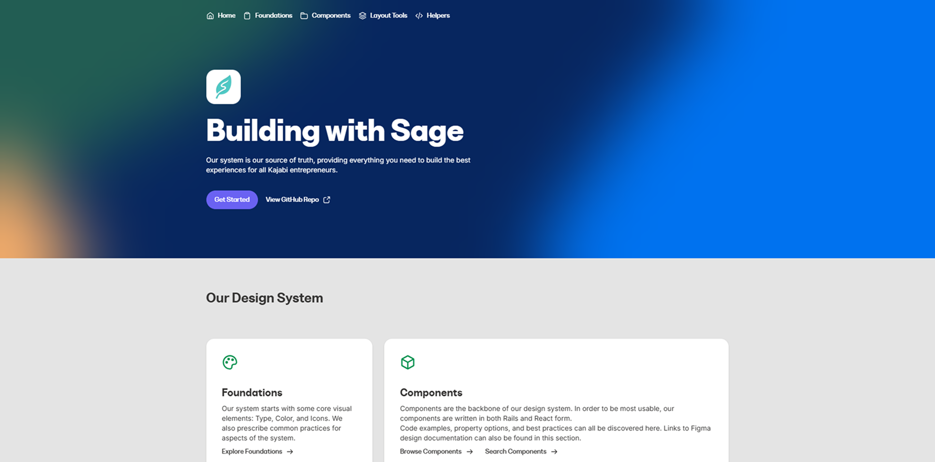
Sage Design System
Kajabi's design system offering core visual elements, components, and guidelines for building cohesive user experiences.
Read more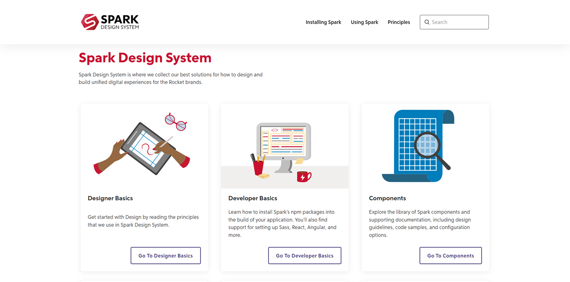
Spark Design System
A design system that collects best solutions for designing and building unified digital experiences for the Rocket brands.
Read more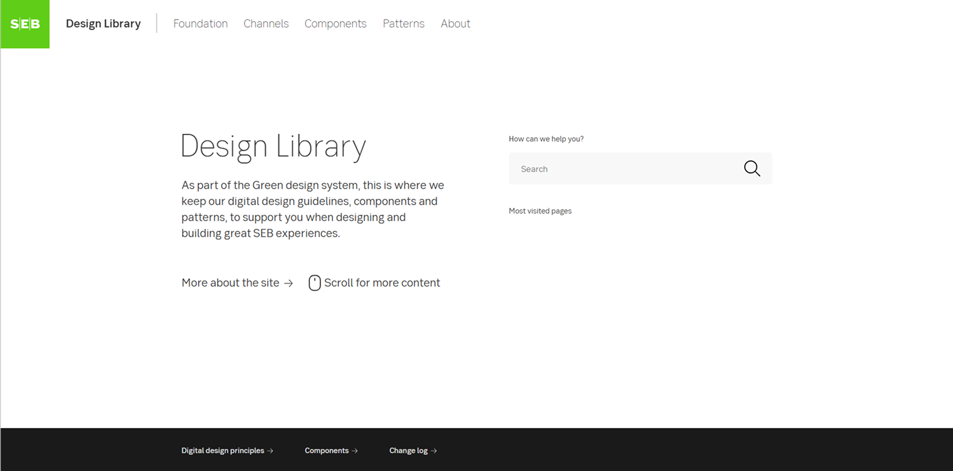
SEB Design Library
Skandinaviska Enskilda Banken's digital design guidelines, components, and patterns for creating cohesive user experiences.
Read more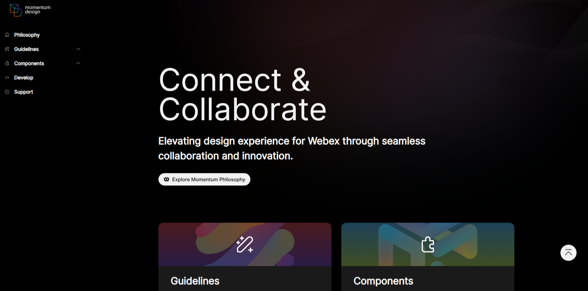
Momentum Design System
Cisco's design system providing components and guidelines for consistent user experiences.
Read more
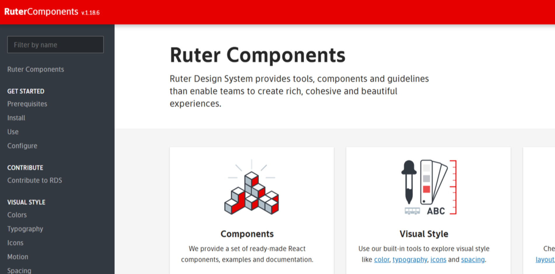
Ruter Components
Ruter's component library providing reusable components for consistent user experiences across their digital platforms.
Read more
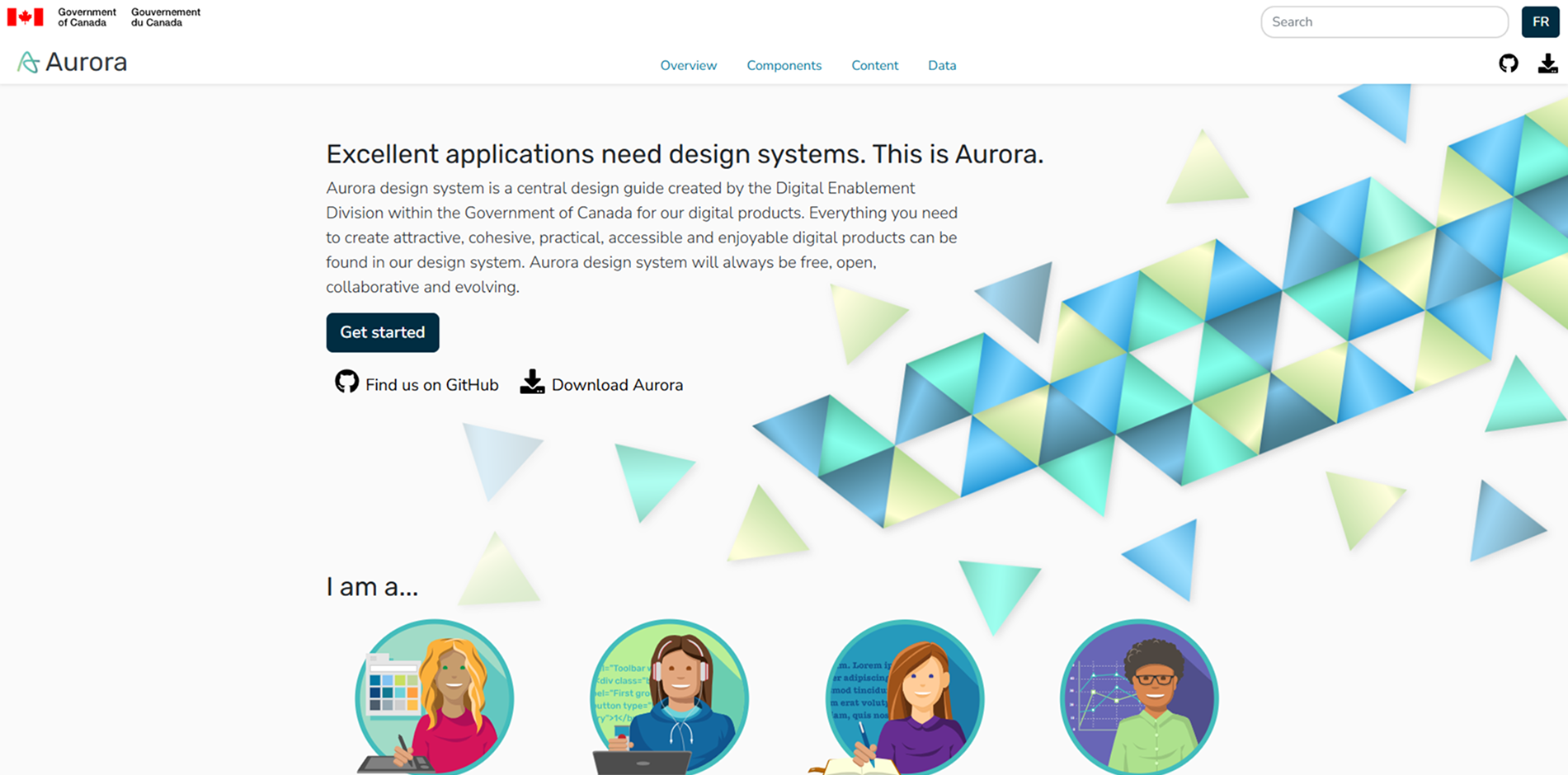
Aurora Design System
A central design guide created by the Digital Enablement Division within the Government of Canada for digital products.
Read more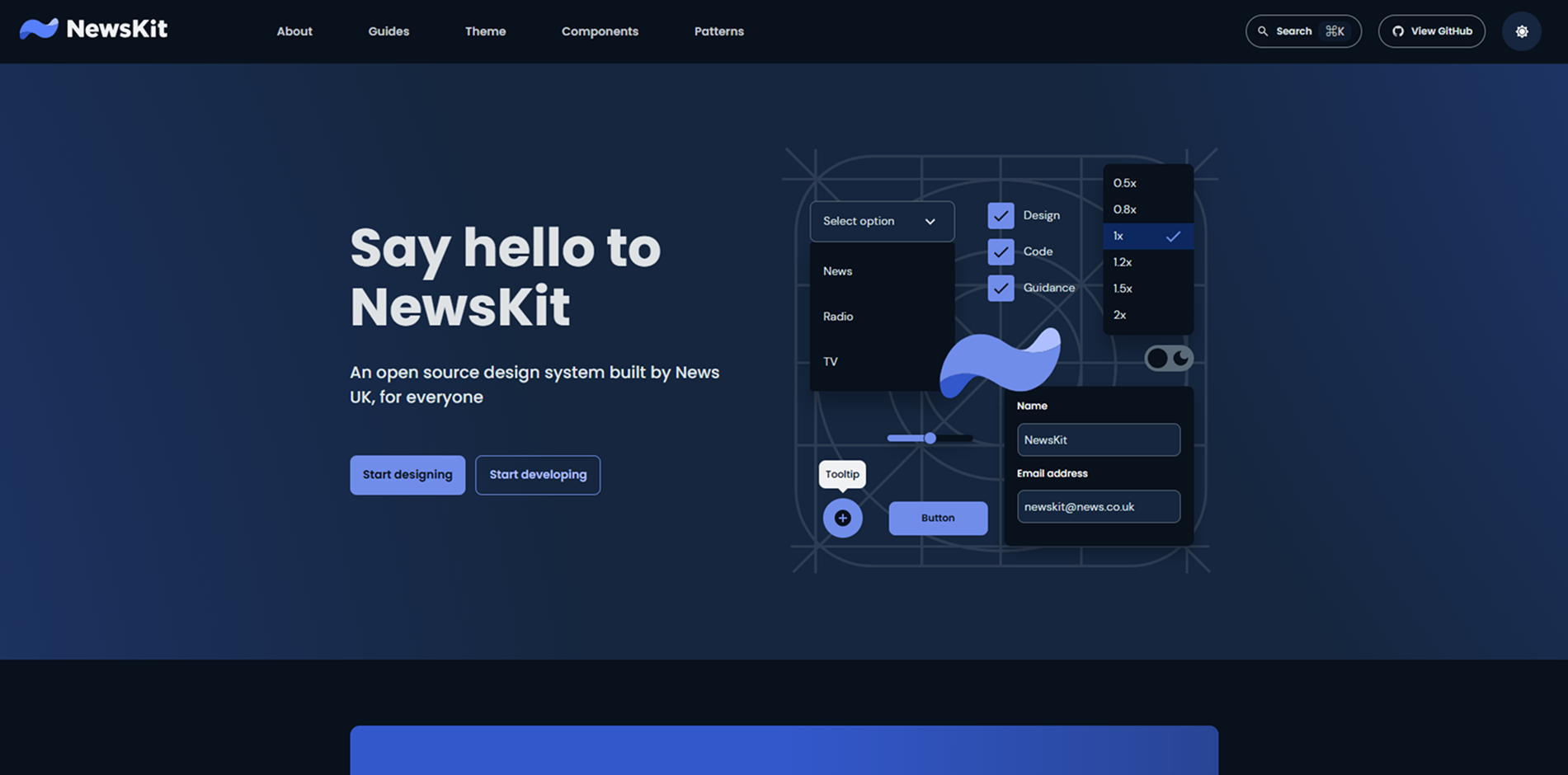
NewsKit Design System
An open-source design system built by News UK, providing components and guidelines to accelerate digital creation and innovation.
Read more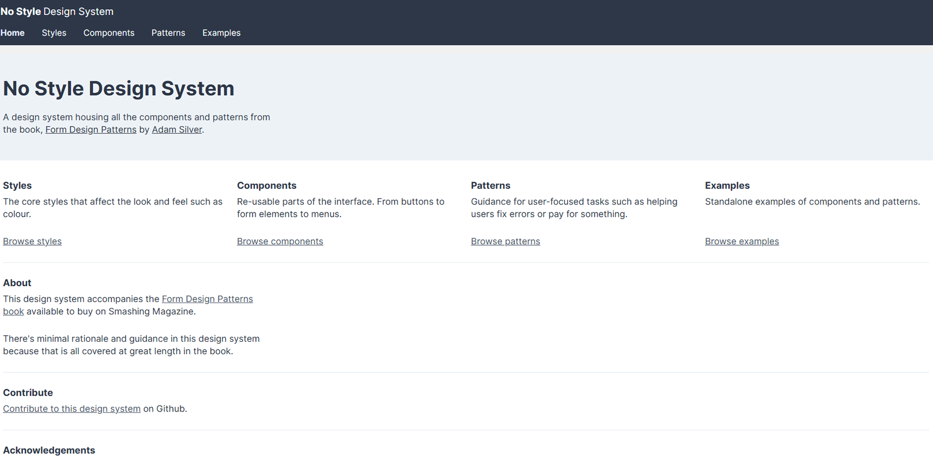
NoStyle Design System
A design system offering unstyled components for maximum flexibility in styling and theming.
Read more
NHS Digital Service Manual
The NHS's service manual providing guidelines, components, and patterns for building consistent and accessible digital services.
Read more