Offcanvas

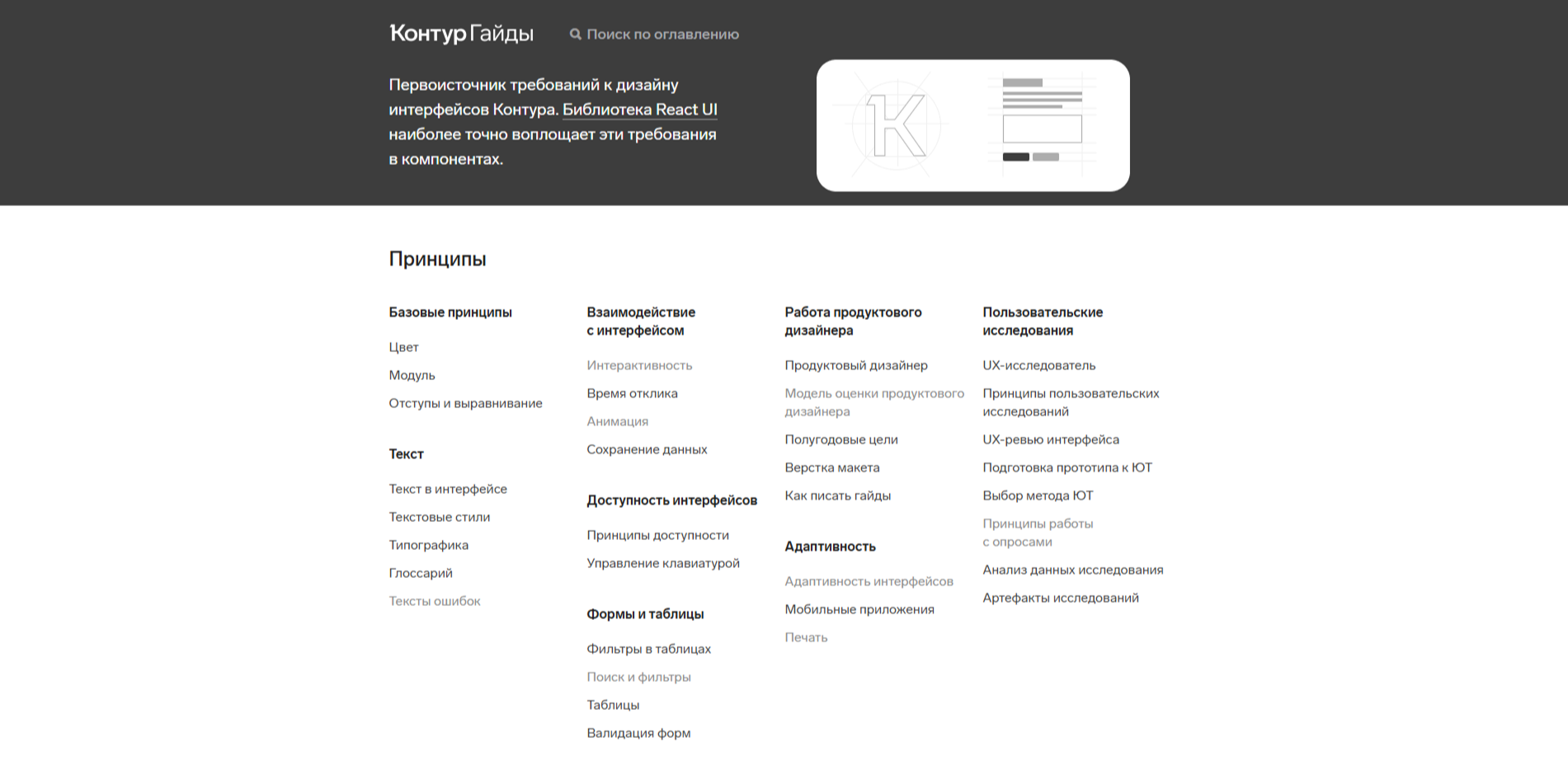
Kontur Design System
Kontur's design system provides flexible and scalable solutions for enterprise-level platforms.
Do you use Kontur Design System?
Design Principles: The system outlines fundamental principles covering aspects such as color usage, modular design, spacing, alignment, typography, and accessibility, ensuring a cohesive and user-friendly interface across all products.
Component Library: A detailed library of UI components is available, including input fields, buttons, menus, navigation elements, pop-up components, progress indicators, and screen templates. Each component is documented with specifications and usage guidelines to maintain consistency.
Accessibility Focus: Emphasis is placed on creating accessible interfaces, adhering to principles that ensure usability for all users, including those with disabilities. Guidelines on keyboard navigation and interactive elements are provided to enhance accessibility.
Developer Resources: The design system is closely integrated with the React UI component library, facilitating the implementation of design guidelines in code. This integration ensures that design principles are accurately reflected in the development process.
Comprehensive Documentation: Extensive resources are available for product designers, including guidelines on user research, usability testing, and best practices for writing and maintaining design guidelines. This documentation supports both new and experienced designers in creating effective user interfaces.